Be bold, be a boring a UX writer
One of the hardest early lessons in a content design career is learning to embrace boredom. You should be boring, unnoticeable, not flashy. It’s incredibly rare that you want the writing in a product to be the center of attention.
Take this unsubscribe page from a HubSpot marketing email:
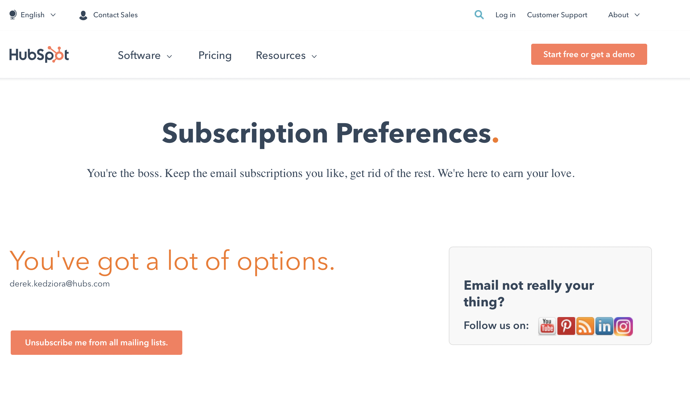
There’s a lot going on there. A lot.
This should be a simple page letting me know that I’d unsubscribed with a secondary role of telling about other options such as unsubscribing from even more emails or following HubSpot on other channels.
Something as simple as:
You’ve been unsubscribed
Want to unsubscribe from all of mailing lists as well? Unsubscribe from allFollow HubSpot on social media instead: [social icons]
But a lot writers would feel nervous handing this in as finished content design. There’s no personality, it doesn’t look like you’ve been trying.
The current text, and what I see from a lot of junior UX writers, is always swinging for the fences when a ground ball will bring in the winning run (note: baseball analogies aren’t good UX writing, but we all go astray sometimes). The writer really tried hard here: empowering the user (“You’re the boss”), asking questions instead of telling (“Email not really your thing?”) and some sort of faux-humility (“We’re here to earn your love” — alright, this is cringe inducing, but I see what they wanted to do).
Like most good design, presenting a content design portfolio should elicit a reaction of “oh, that’s all you did?”. Why yes, you made sense of a complex product and made the person’s day using it just a bit easier without drawing any unnecessary attention to yourself. That’s good UX writing.