Centered Text Is Lazy
Websites with long stretches of center aligned text are everywhere, even big enterprises are doing it. Presumably, these companies spend thousands of dollars on design, yet they still end up with pages that are hard to read. What gives?
The solution is simple: don’t use text-align: center; unless there’s a compelling reason or you text is a single line. You’d be better off centering block elements and keeping everything left aligned within that element. You still get text that looks tidy and centered, but you keep an easy-to-read left alignment.
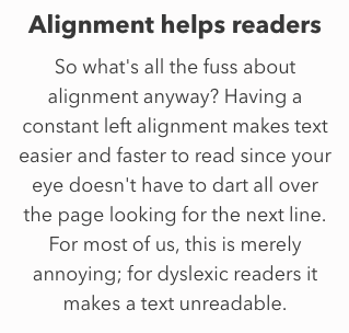
Alignment helps readers
Having a constant left alignment makes text easier and faster to read since your eye doesn’t have to dart all over the page looking for the next line. For most of us, this is merely annoying; for dyslexic readers it makes a text unreadable.
Take a look at the preceding paragraph in center alignment. This is harder to read and the jagged left edge makes the page look cluttered.
Not all centered text is inherently bad. Done properly, a centered title can look striking. If you’re going to center a title that has a tagline and a paragraph under it, you have to get creative.
Centering titles with a clean left edge
An underused trick to get both a centered title and a left alignment is to use this CSS:
max-width: -moz-fit-content;
max-width: -webkit-fit-content;
Set the h1 to text-align: center; and the following p to text-align: left; You’ll get something that looks centered yet still has a clean left edge.
Another approach is to create a div with a fixed width, use text-align: left; and then center the div with margin: 0 auto; These texts still look centered but are easier to read.
Sites that get it right
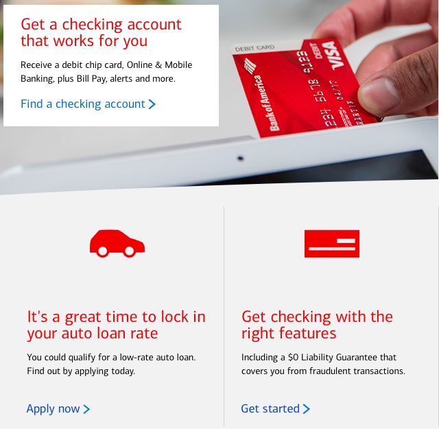
Bank of America nails it with a centered image over left aligned text:
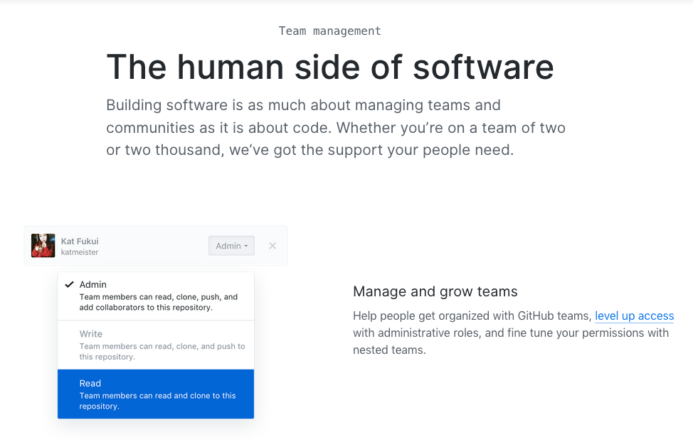
GitHub moves even the image over to the left:

Microsoft uses images that are the same width as the text:

Sites with too much centering
Trello’s a hot mess:
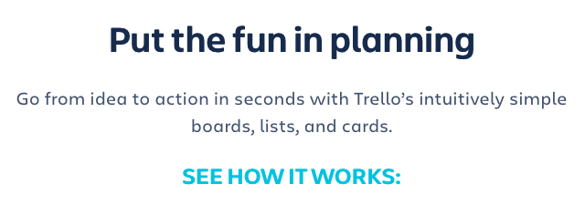
That’s four separate alignments for text that is a single unit.
It’s an easy fix, though. Decrease the width of the div, align everything to the left and then put the div anywhere on the page:

Using the same tweaks of narrowing the div and aligning everything to the left, you can get a much more readable design that still looks centered in GitHub:
AWS has long content along with too much spacing between related headings and paragraphs. Left aligning it makes it readable:
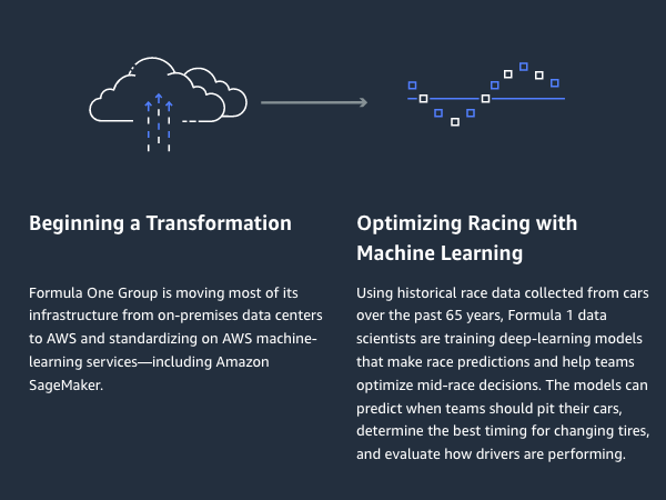
Apple is in a class of its own
Of the major tech companies, Apple takes the prize for hard to read copy.
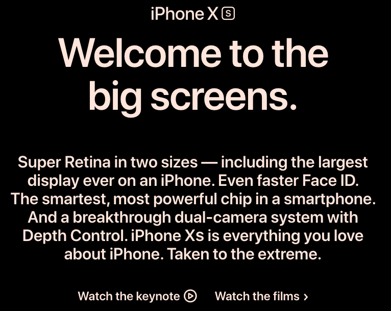
Even changing the alignment, font size and margins doesn’t do that much to improve the readability:
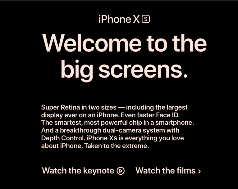
The real problem is content. Maxim Ilyakhov’s point that Apple has terrible copy is relevant, and he’s also right that it doesn’t matter. If you have a great product, you can get away with a poorly designed website and awful content.
Strangely enough, some companies don’t want you to read their copy. By the time you’re on Apple’s website, you’ve probably already made up your mind to buy an iPhone. Apple’s copy isn’t driving conversions.
Good copy and legible typography can be distracting. You can’t just leave a page empty, so the alternative is to drop in some filler text that’s never meant to be read. I can see this for Apple or AWS, but it’s a questionable practice for small businesses that end up with centered copy because of some bootstrap template.
Design and content can’t be separated
I’ve heard the argument that HTML shouldn’t be presentational to mean that content writers and designers shouldn’t work together. That’s absurd. The technical reasons to keep HTML and CSS separate have nothing to do with content and design influencing each other.
Part of the problem with the example from AWS and Apple is that the copy is too long. The taglines morphed into body length paragraphs. The designers should have rejected the copy and used copy that was more designable.
At bigger companies the standard workflow for making a landing page goes something like this: the content writer comes up with the text without ever seeing the design, the designer only uses lorem ipsum without ever reading the text and whoever does the markup talks to neither the designer nor copywriter. A more sane approach would be to sit the three down together, go through personas and users stories, discuss a common approach and then find copy that works for the design. I’ve yet to see this in practice. Content and design are usually separate departments with competing project managers.
The web typographer
Typography usually gets shunted off to designers. Expecting every designer to also be a typographer is akin to expecting me to write poetry simply because I’m a copywriter.
Most copywriters and designers can benefit from a few hours of going through typography fundamentals. Better Web Typography and Practical Typography are good places to start. A few small improvements to typography can really improve the appearance and readability of a site.