The Paucity of Good Design
We should be living in a golden era of software design. We’re not.
User experience (UX) is everywhere. Big companies invest in UX researchers, designers, writers and usability sessions. These new professions have spawned their own genre of books, blogs and conferences (or more cynically, bullshit).
Nonetheless modern products are mostly rubbish. Most modern, “well designed” products suffer from 3 main problems:
- Everything feels like an engagement trap regardless of whether that’s the right business model.
- The UX industry assumes everyone is an idiot, which makes products harder to use.
- Even on new and expensive devices, software feels slow and buggy.
The Engagement Trap
New software is just a reworking of Nir Eyal’s Hooked. The engagement model is too hard to pass up for most companies: offer free or artificially cheap content and software. Monetize attention.
If this led to a two-tiered system of low quality content for the masses and higher quality products for purchase, fine. I could live with that. Instead the engagement business model is creeping up.
I’ve long wanted to subscribe to the New York Times and Economist. But an expensive subscription doesn’t opt me out of their vast tracking and ad tech juggeranaut. You’re also shunted into an auto-renewal scheme that’s a real hassle to cancel.
I buy Kindle books with the expectation that I can read them in peace. The iPad Kindle app has gone from a lovely reading experience to having in-app notifications that can’t be disabled with constant nags to buy more books.
This greets me when I open the Kindle app:
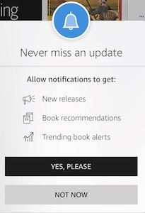
These notifications are impossible to disable:

Fair enough. Amazon is a slimy company. Switching to Apple Books should get me out of this, right?
Not so fast. While the experience is better, the store is never completely out of sight.

There’s no way to use a reader app that I paid for as just an epub and PDF reader app. Apple’s pivot to services is only going to make this worse.
Sure, these are minor annoyances, but they compound. The Apple Music app is a front for Apple’s music subscription. It takes clicking and toggling to figure out how to actually play my own music files on a device I own. I’m seeing this all over the OS now.
As far as I can tell, this trend is everywhere. I’ve heard similar horror stories from Windows and Android.
If you buy modern software, expect a barrage of notifications, gamification (no, I don’t need an attaboy for reading five minutes a day) and constant upsales.
Too Much UX
My first computer was an Apple IIe. The assumption was that it was a professional tool. Someone would invest time in learning how to use it, likely have multiple printed manuals and constantly update their skills. In that glorious era, computer literacy was a skill to be honed like carpentry or cooking.
Some investment of time and money was required before using software. This investment would pay dividends in long-term productivity.
The user experience industry has the exact opposite assumption. Users are simpletons, little more than sea sponges floating in the current. People will never read a manual before using something and each product must be self contained. A random person with no intent to actually do something has to be able to be engaged if they accidentally open a product.
For Facebook, Twitter and YouTube this makes sense. Their business model depends on it. Yet this approach is creeping into professional-grade software.
The symptoms are modern, “well-designed” products having almost no documentation, interfaces that can’t be managed with keyboard shortcuts and the standard gamification, nudges and engagement.
Take Abstract, a git system for design software, as an example. There are plenty of peppy empty state messages but keyboard shortcuts are a mess, documentation is lacking and I’m constantly hitting bugs. I’d prefer a toned down UX, an extensive manual (they have a lot of quasi-marketing case studies instead of proper documentation) and a product that simply works better. A native Mac app, not electron, is simply too much to hope for.
My general observation is that people in the 30–50 age range tend to have strong general computer skills. If they’re going to use new professional software, they’ll take the time to learn about it first. They tend to know how systems work and then adapt to individual instances. They navigate almost exclusively with keyboard shortcuts, use spreadsheets with complex formulas and tinker with writing their scripts.
The under-30 crowd uses computers in a fundamentally different way. They’re pros at individual apps. They might have a few different email apps but have no idea how to manually configure their IMAP settings. They are slow typists, depend on touch interfaces and mouse navigation. Even the way they talk is different, they read Kindle and Medium rather than books and blogs.
There’s no point in making things harder to use (desktop Linux will always be around for the masochists). I don’t think apps in my second group, for the stereotypical 20 something, are actually easier to use. The interfaces are too wordy, everything takes a bunch of screens with colorful steps reassuring me along the way and usually aren’t scriptable.
The best way to describe this is to look at examples of great products that I’ve happily bought: Sublime, Things, News Explorer, Byword.
Products that don’t Work
I started using my old iPad Mini 4 as a spare device. It’s a mere five years old. The lag time when loading “modern” sites that are mostly text is insane. Many newer apps (not graphics heavy or video editing) are too slow to use.
Wikipedia, the old behemoth running on PHP with almost no client side JS, loads instantly. Old school sites and apps run just fine. Most “modern” apps are slow and barely work despite offering no greater functionality. For instance, old.reddit.com loads significantly faster than the new Reddit.
The best apps are fast apps. The older internet loaded much faster despite slower connection speeds and computers. It comes down to hype cycles and putting developer experience ahead of user experience.
It’s strange when billion dollar companies pretend they are startups and release buggy software (move fast!) that lags and barely works. Ironically all of my examples of great design are from tiny companies.
Modern Software
When I hear about a new product in 2020, here’s what I expect:
- Needless notifications
- Infantilizing gamification
- A visually pleasing design
- Each action has lots of stops broken into separate screen with peppy text
- Minimal keyboard shortcuts
- No way to use external scripting or macros
- Little documentation but lots of SEO marketing blog posts
- VC funded (or a “startup” within a large company) and unprofitable, which means it will be out of business in a few years
As much as people think we’re in the middle of a great tech boom, we’re in a software design desert.