Typography and history
I’m making my way through the Visual History of Type, which is a feast of typography. Starting with the earliest typefaces in Europe and ending the in the early 21st Century, each of the 300 or so typefaces surveyed gets a historical write up and samples. It’s a dream for typography nerds.
I’ve made it up Thorne’s Fat Face in the early 1800s:
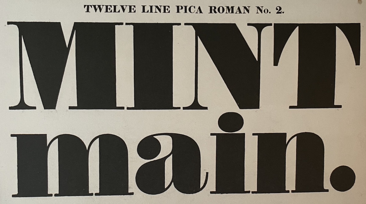
Here’s the description that goes with it:
Thorne adapted his modern style to make a bigger, bolder, blacker design than any before, specifically for use on posters and hoardings in dense city environments. In his Fat Face the thick strokes of Thorne’s modern letterform are swollen to an extreme thickness and joined abruptly to connecting strokes and serifs that remain hairline-thin. The overall appearance is one of massive contrast in an alphabet that is ingeniously designed to be both obese and sprightly at the same time. Much playful variation is contributed by alternations of stroke endings, which range from bracketed and flat hairline serifs to triangular wedges and colossal ball terminals.
The fat faces, first seen in use around 1806, appalled many people. One critic, Thomas Hansard, described them as having ‘preposterous disproportions’. However, they were remarkably successful. They attracted attention both to themselves and to the messages they carried and in the process brought about a transformation in the ways in which people interacted with text. Posters showing huge, bold words presented short, fragmented propositions, overturning the conventions of discursive reading and permanently changing the paradigm of social communications.
Thinking about the information clutter and overload that confront us today, it’s interesting to see how it all started in the 1800s. Before this, there wasn’t high enough literacy, population density, or mass printing to produce information clutter on a societal level.
Most of us would look back on these typefaces as something interesting, even beautiful. I certainly like the contrasting stroke widths. Yet, this was the SEO and social media of its day: shouting, demanding attention, advertising-driven ,and forcing people to read smaller chunks of text rather than long, thought-out pieces. I somehow doubt our cookie-cutter landing pages will be so fondly remembered in 200 years.
This book is definitely a typography book, but it’s the tidbits of how typography has influenced history that really make me like it so far. I’d like to see something further in this genre: history through the eyes of a typeface or another similar technology—even history from the perspective of an iPhone.
Another book on my list to read is Palatino: the Natural History of a Typeface. Not exactly the history of something greater through the lens of a typeface, but still interesting to do a deep dive into a single typeface.
Not about fonts or technology, but the closest book to this type of perspective that I’ve read is Microcosm: Portrait of a Central European City, which tells history from the point of view of a city, rather than the typical nationalist telling of European history. It’s a great read, by the way.