Modular typefaces
I’m still making my way through The Visual History of Type. There’s something wonderful about being on pace to finish a book over the course of a year.
What I’ve noticed about the 1920s and 30s is the proliferation of experiments in geometric and modular typefaces. In the background, the Bauhaus and similar movements were simplifying other types of design, so this makes sense historically.
Here’s an example of one such typeface, Fregio Mecana:
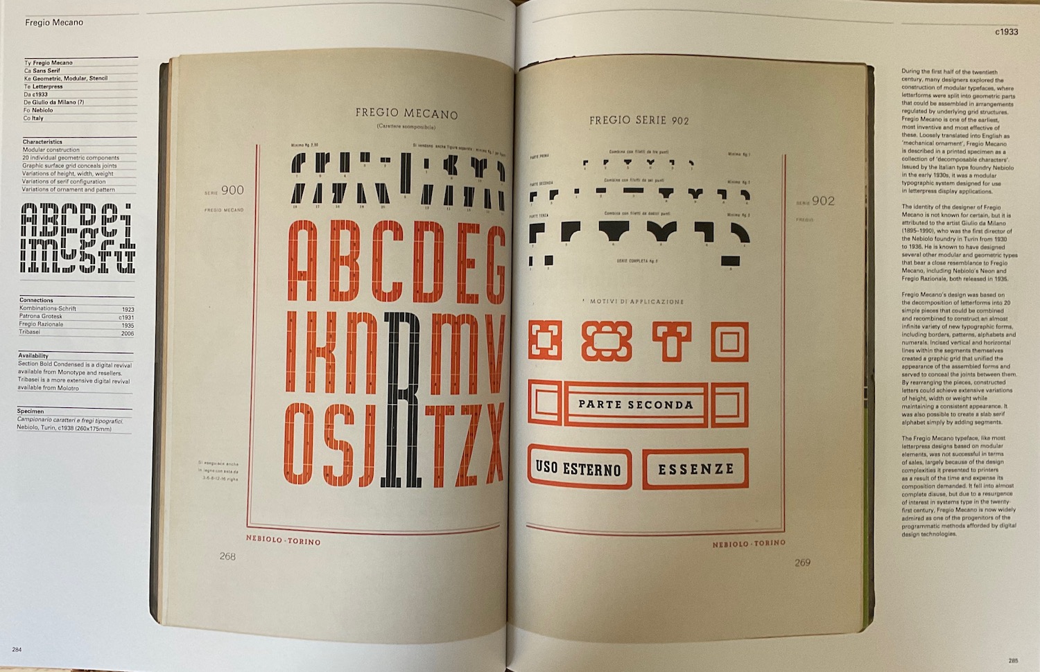
The process and thinking behind these typefaces is neat, reduce the alphabet to a few atomic bits and then build up. The geometric typefaces that were made with only a compass and straightedge mix simplicity and complexity. I really like them as artistic creations, as graphic design.
But modular typefaces weren’t economical or practical in the era of print — it was more time consuming to build up letters than work with already assembled sets. I suppose in the digital age, it wouldn’t be much different. Most designers want to plug a font in and be at it.
Modularity is taken as a goal in and of itself these days. Literally every single job I’ve had has had bits about modularity and scalability. That’s why it’d be interesting to look more into cases where modularity has failed.
This also makes me wonder more broadly about design systems. Are they best thought of as modular components such as Atomic Design? Are they sprawling component libraries instead? Or is a design system a set of heuristics?
It will be interesting to reflect on the design trends of our era with the hindsight of a few decades. I wonder how many of our design systems will be historical oddities and how many will have stood the test of time.
It’s nice that a book about the history of typefaces can inspire such thoughts.