Concepts, Failures and Moving Forward
I’m still reading through and commenting (post I, post II) about The Visual History of Type. Now I’m in the 50s, 60s and 70s.
This time period is a mixed bag that produced some of the most foundational typefaces such as Helvetica (1957), Courier (1955), Optima (1958) and then a lot of unremarkable stuff that history has quickly forgotten.
In the background, phototypesetting made typography accessible to more people. It’s easy to forget this moment in technological history because it’s so overshadowed by the personal computer emerging mere decades later. Nonetheless, this was the first major shift that took typography from the highbrow realm of printers to the people actually designing the end product. To quote the book:
The major shift that occurred in the way that type was used during the 1960s and 1970s with the advent of photosetting and dry-transfer lettering had a permanent effect on the industry, expanding the practice of graphic design as an independent profession as it removed artwork production from printers.
And thus as fonts became more mass-market, they become less remarkable. The same is also true of writing: I doubt much of what’s been published on Medium, Wordpress, or Blogger will be remembered in a century.
Besides the mass-market and trendy — they really went for condensed type in the 60s, there were some interesting concept typefaces. In some sense a failure because they were either unreadable or not used, they also paved the way for things that could be called successful.
New Alphabet(1967) by Wim Crouwel is a typeface that’s not really used by anyone but explored how technology was influencing type and looked for a future.
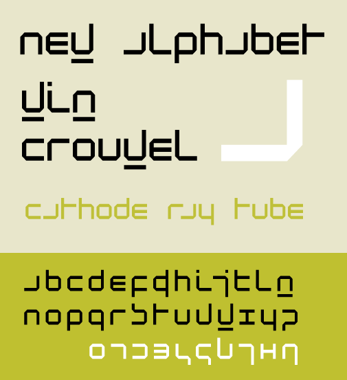
The idea is that type would eventually have to conform to digital displays, which were primitive at the time. This was also when optical character recognition (OCR) was developing. This doesn’t look too different than OCR optimized fonts such as OCR-A and OCR-B.
I’m also intrigued by the font Sintex (1972ish). Traditional typography puts all the emphasis on vertical weight. Sintex does the opposite, with a strong horizontal emphasis.
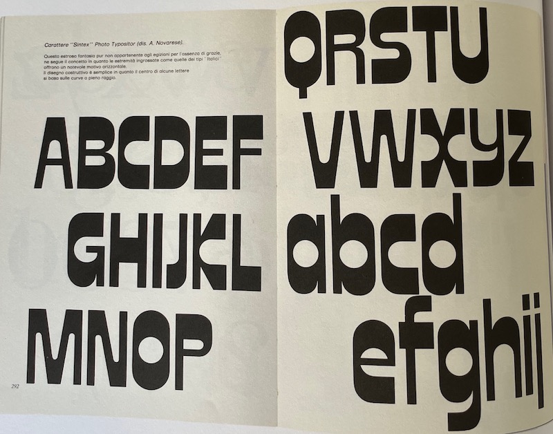
It would be hard to use this in any serious context, but there is a later typeface that takes this concept and executes it beautifully. Enter FF Balence. This is a striking typeface and the link has plenty of real world examples of it.
What I’ve taken away from this:
- You can’t really know what’s going to be important at the time you create it. A mix of time, history and chance are the judge and jury of any creation.
- Concept work and failed iterations are important. We also don’t know what failed rabbit hole will inspire something else, that in turns inspires another iteration that goes on to be important.
- Progress and development aren’t linear.
- Stepping back and trying to see beyond the limitations and fashions of your own era is a powerful practice.